Don’t look now, but these Google apps are getting a new look
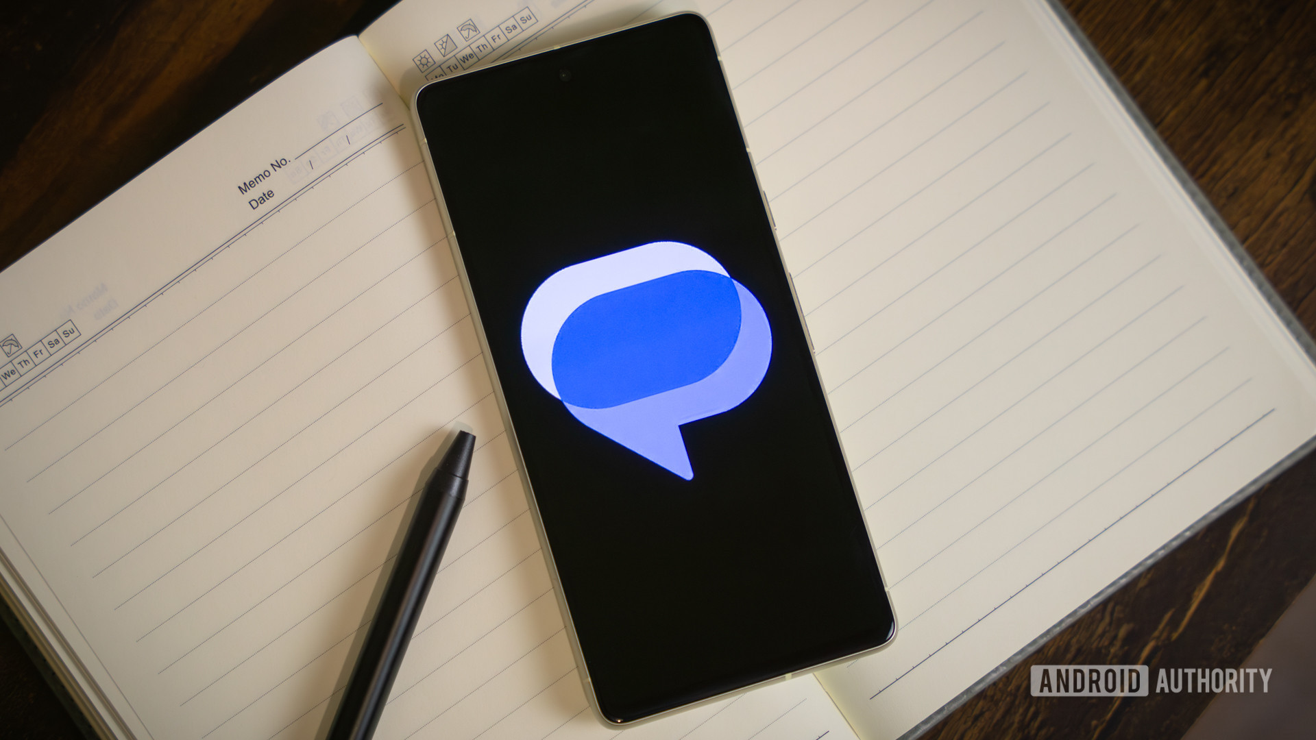
Google announced a visual redesign for three native Android apps, introducing gradient-based icons and refined curvature to align with the company's evolving design language. The Messages app icon redesign previously leaked, and the rollout now includes Contacts and Phone by Google.
Key points
- Three Google apps receiving icon redesigns
- Gradient colors and updated curvature applied
- Part of broader visual consistency effort
Summary and key points written by AI from the headline and a short excerpt, so they can be incomplete or wrong. Android Authority did the reporting; read the original for the full story.
Read the full story at Android Authority